A blog that reads like a magazine
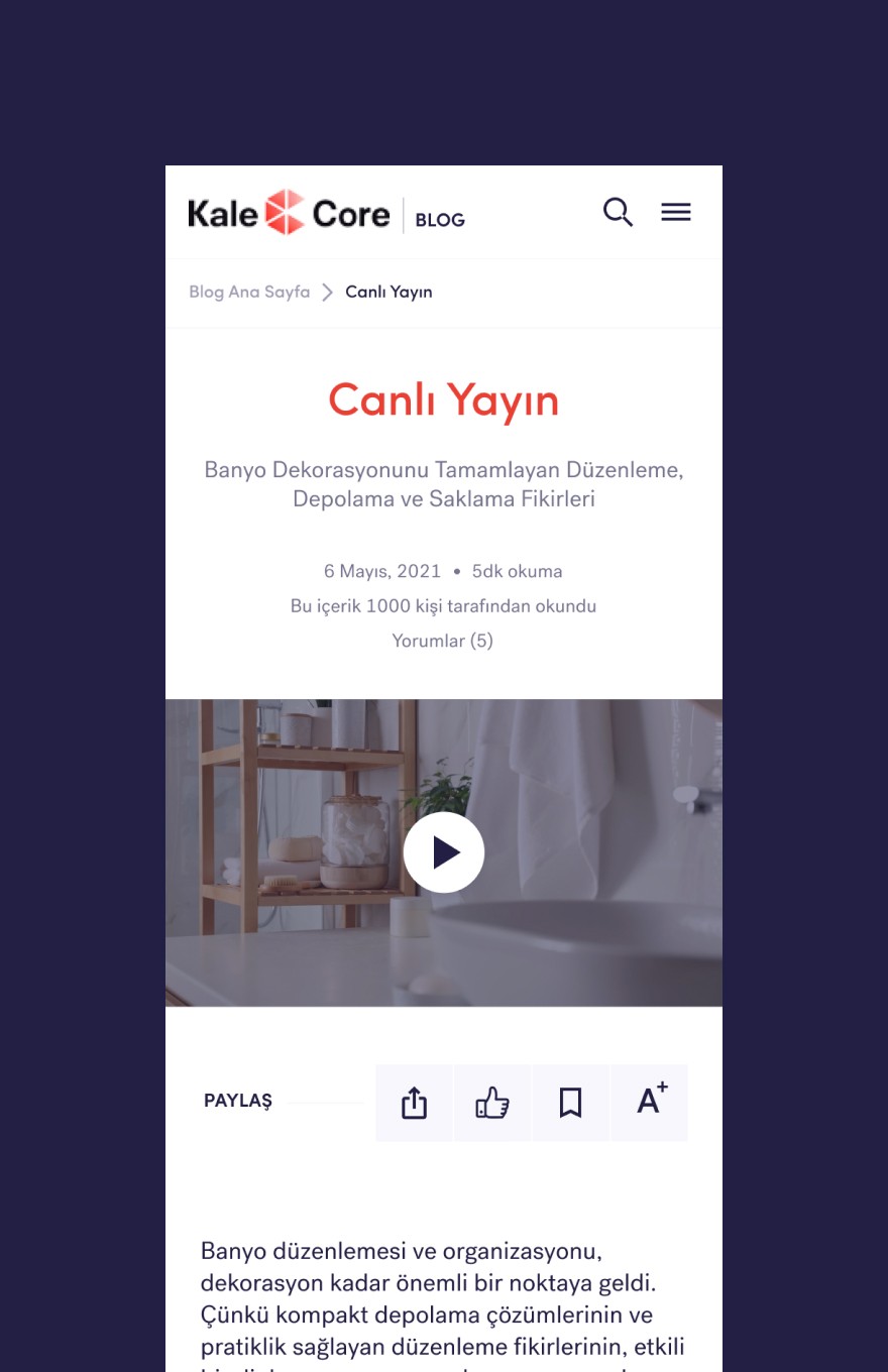
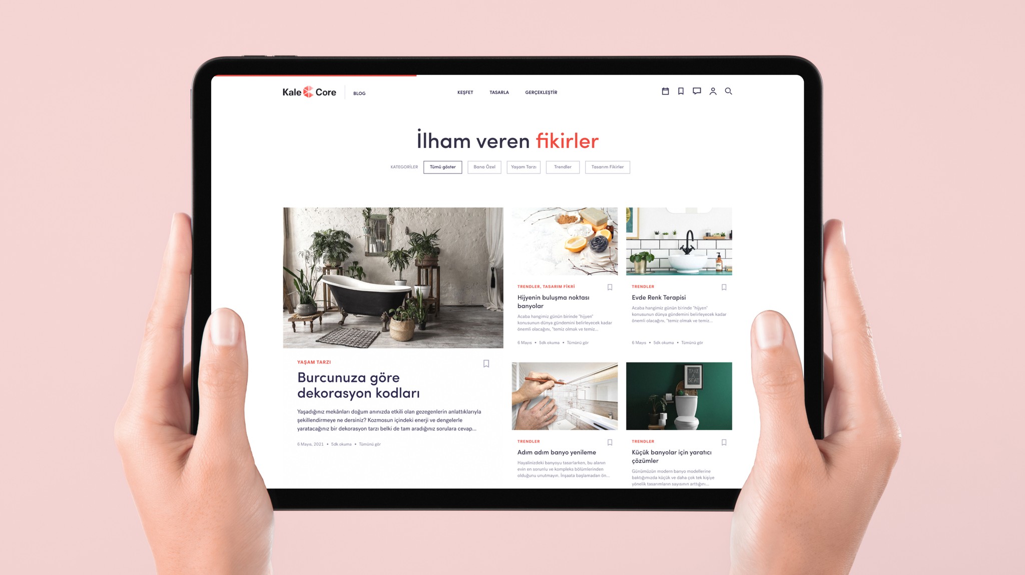
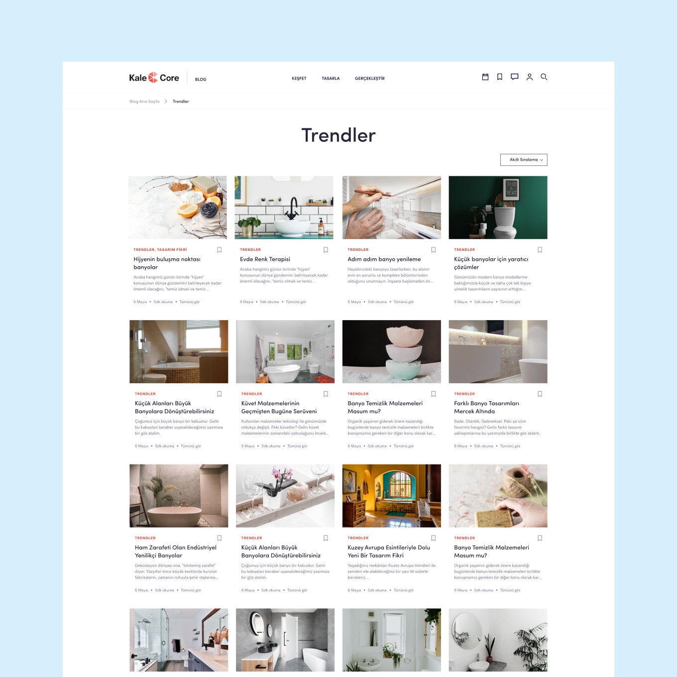
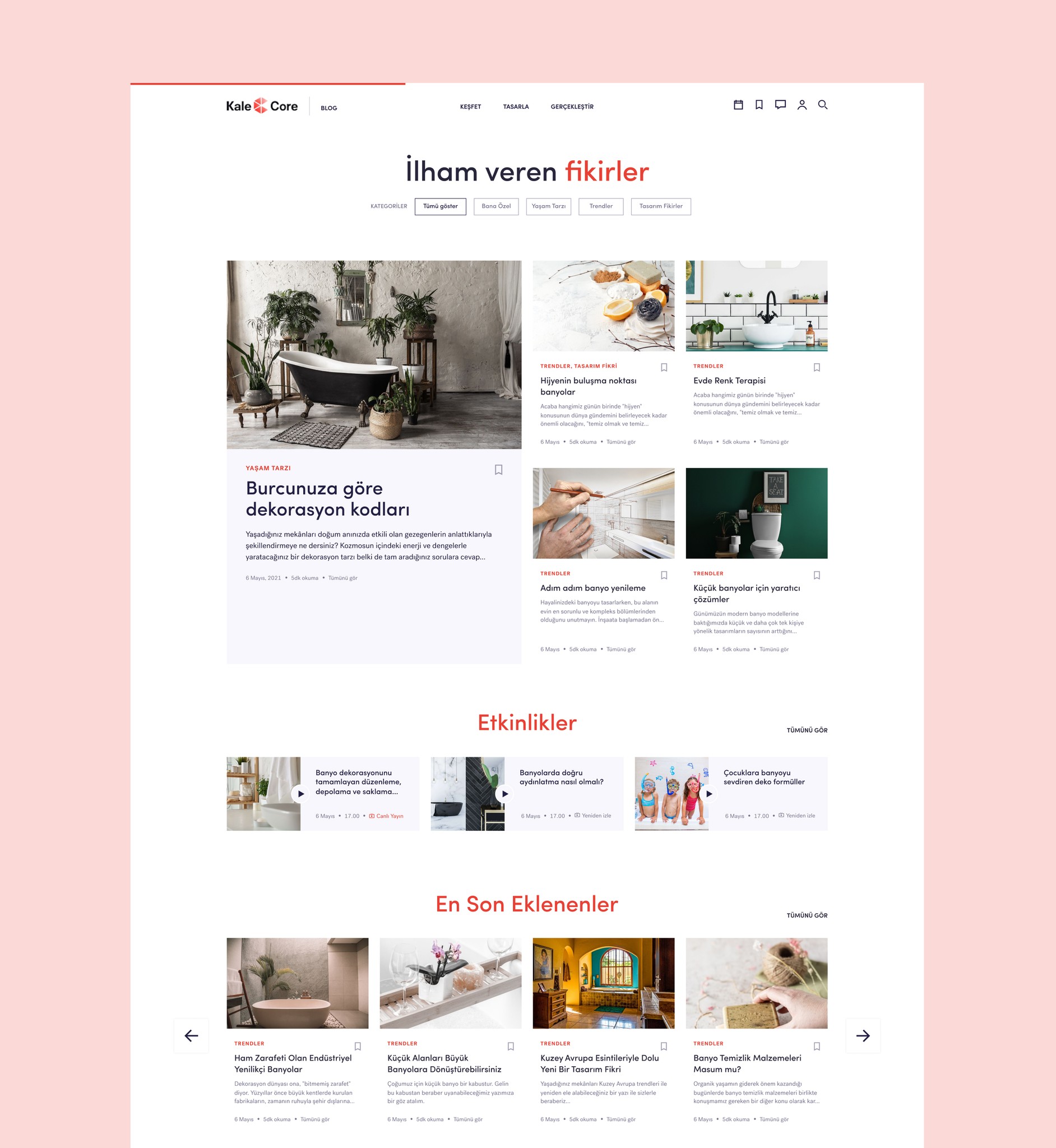
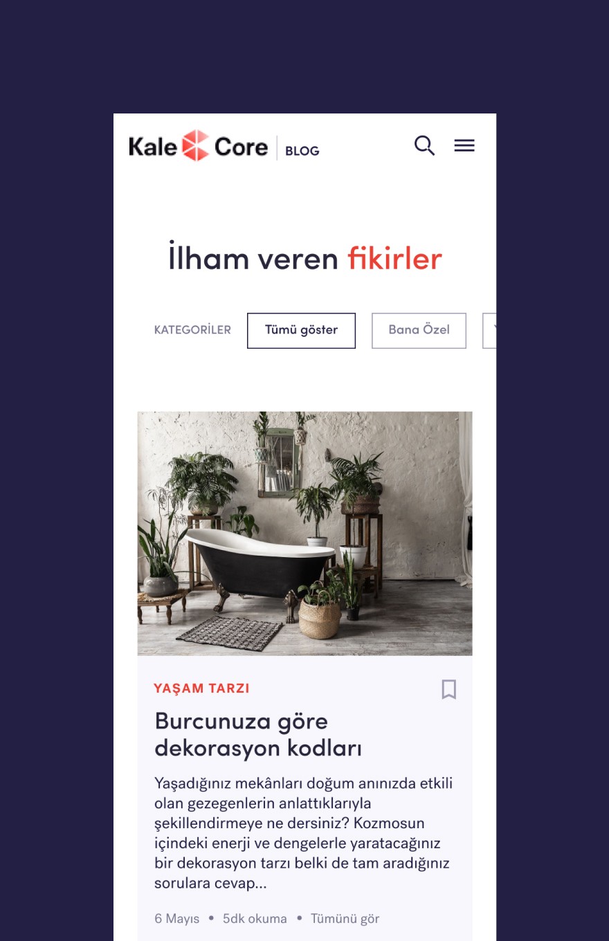
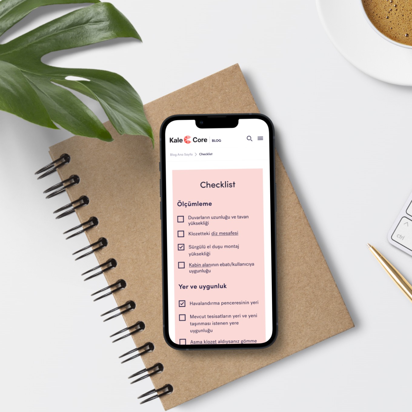
The blog groups content into categories that match how people think about renovation: trends, living spaces, checklists and live streams. My job was to translate these layouts into clean, semantic markup that stays fast and easy to browse.
Responsive down to the details
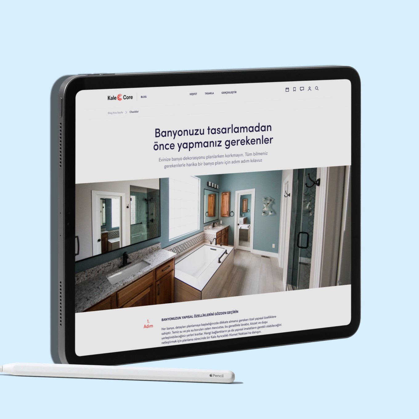
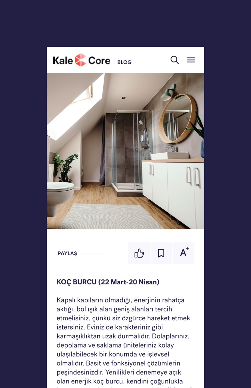
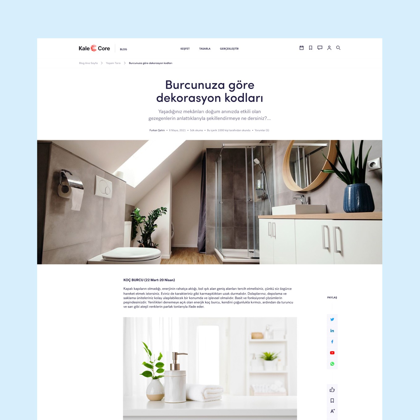
Article pages, category listings, live stream pages and interactive checklists were built responsive from mobile to desktop. Sharing, saving and font-size controls stay within reach on small screens, and imagery keeps its ratio across breakpoints.
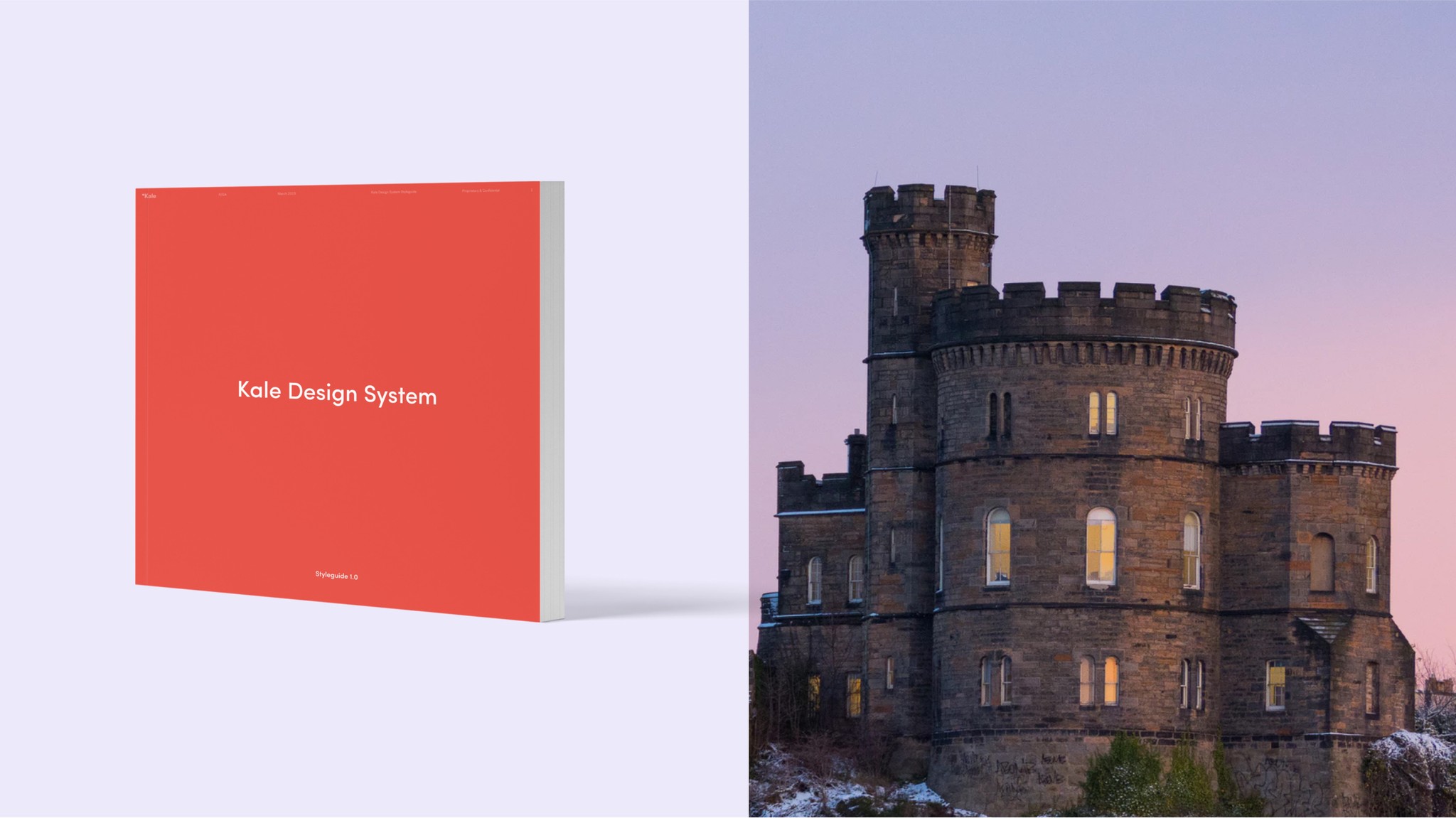
Built on the Kale design system
Colours, typography and components follow Kale’s existing design system, so the blog feels like a natural part of the brand and can grow with new content types over time.