A symbol shaped like a path
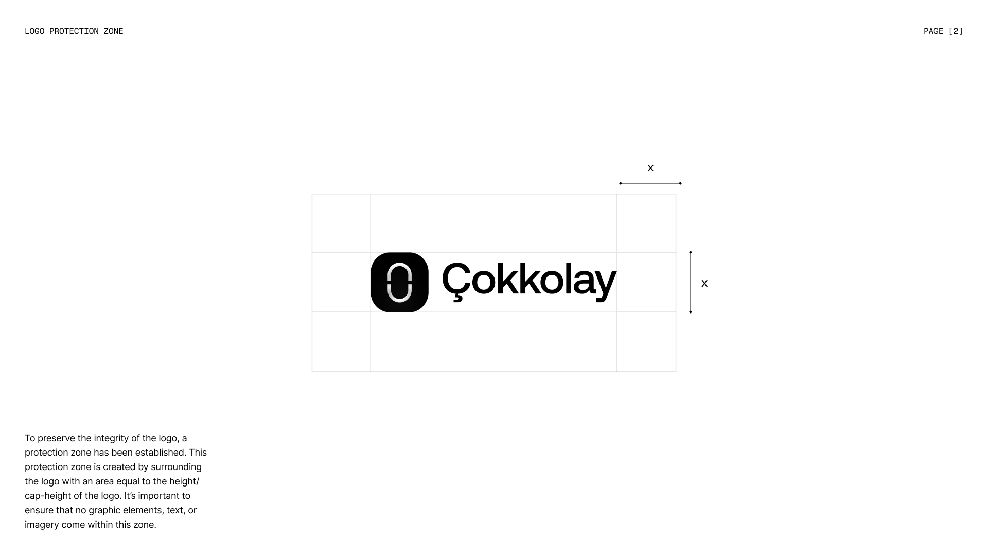
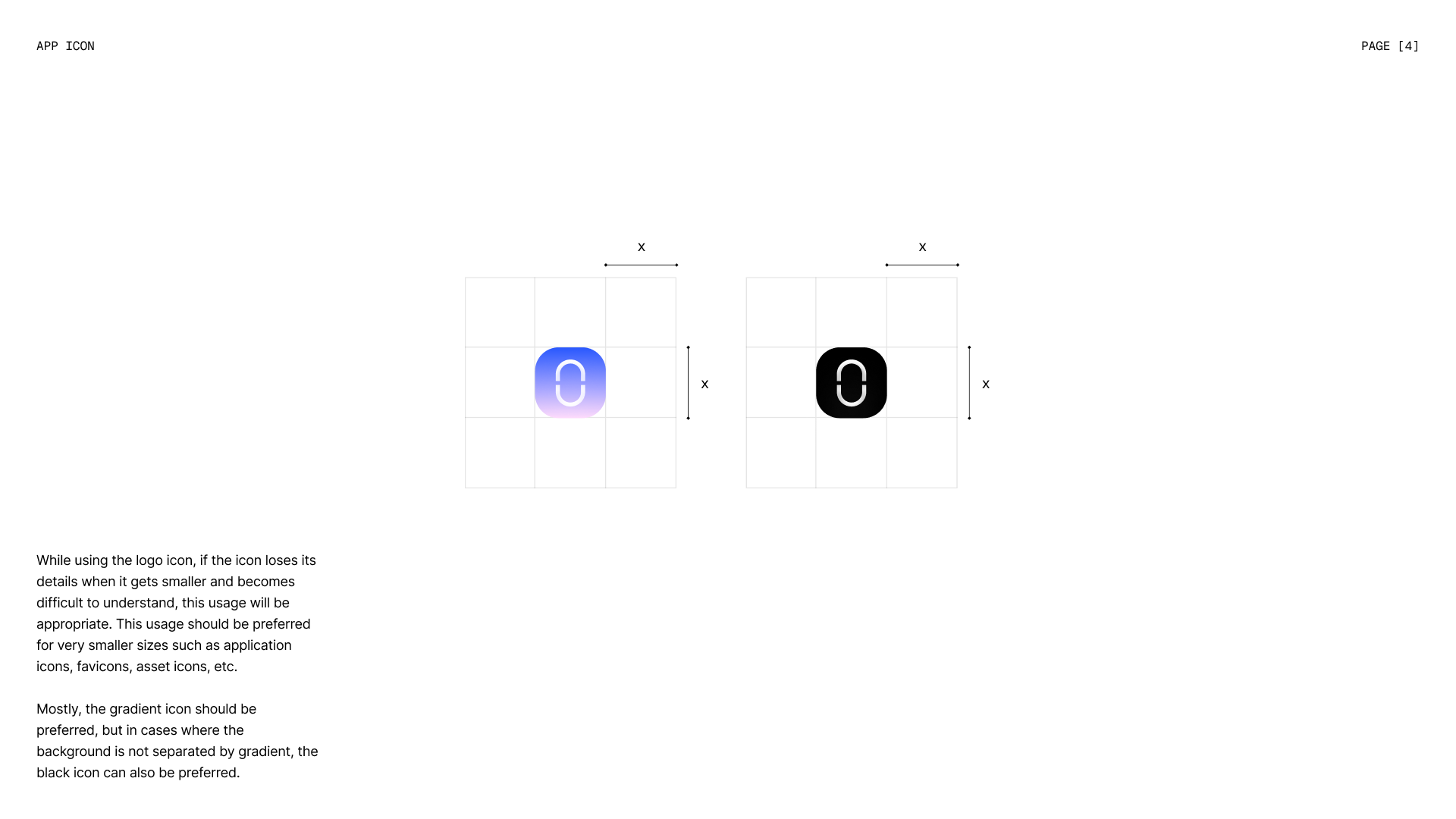
The split in the Çokkolay icon represents a path. Every student passes through it, entering with questions and uncertainty, leaving with clarity. The mark is the seal of a philosophy: a map of the potential locked within every individual, waiting to be discovered. Its open yet integrated form reflects learning as a boundless flow rather than a closed box.
From chaos to clarity
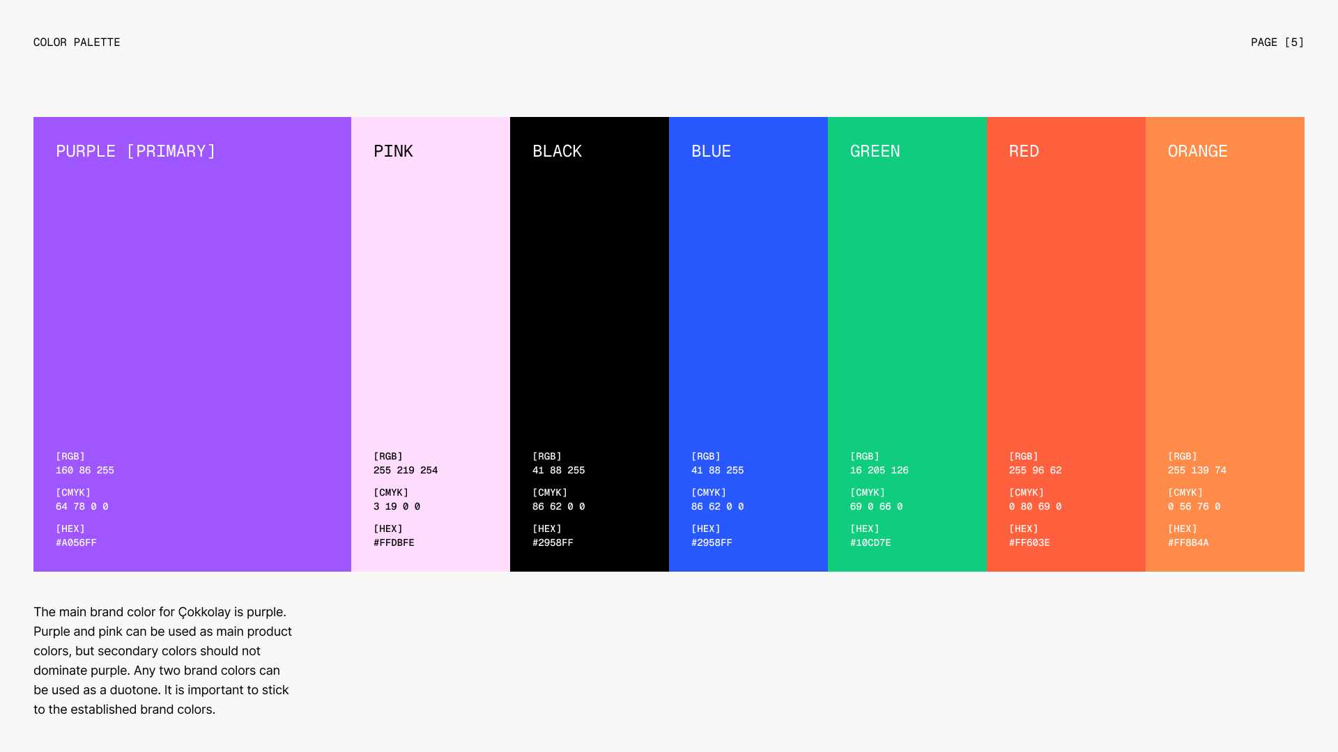
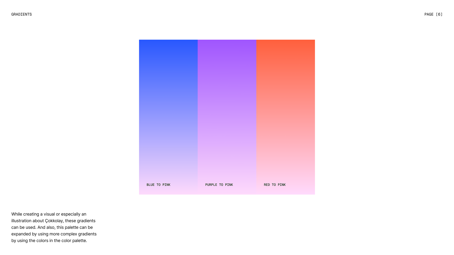
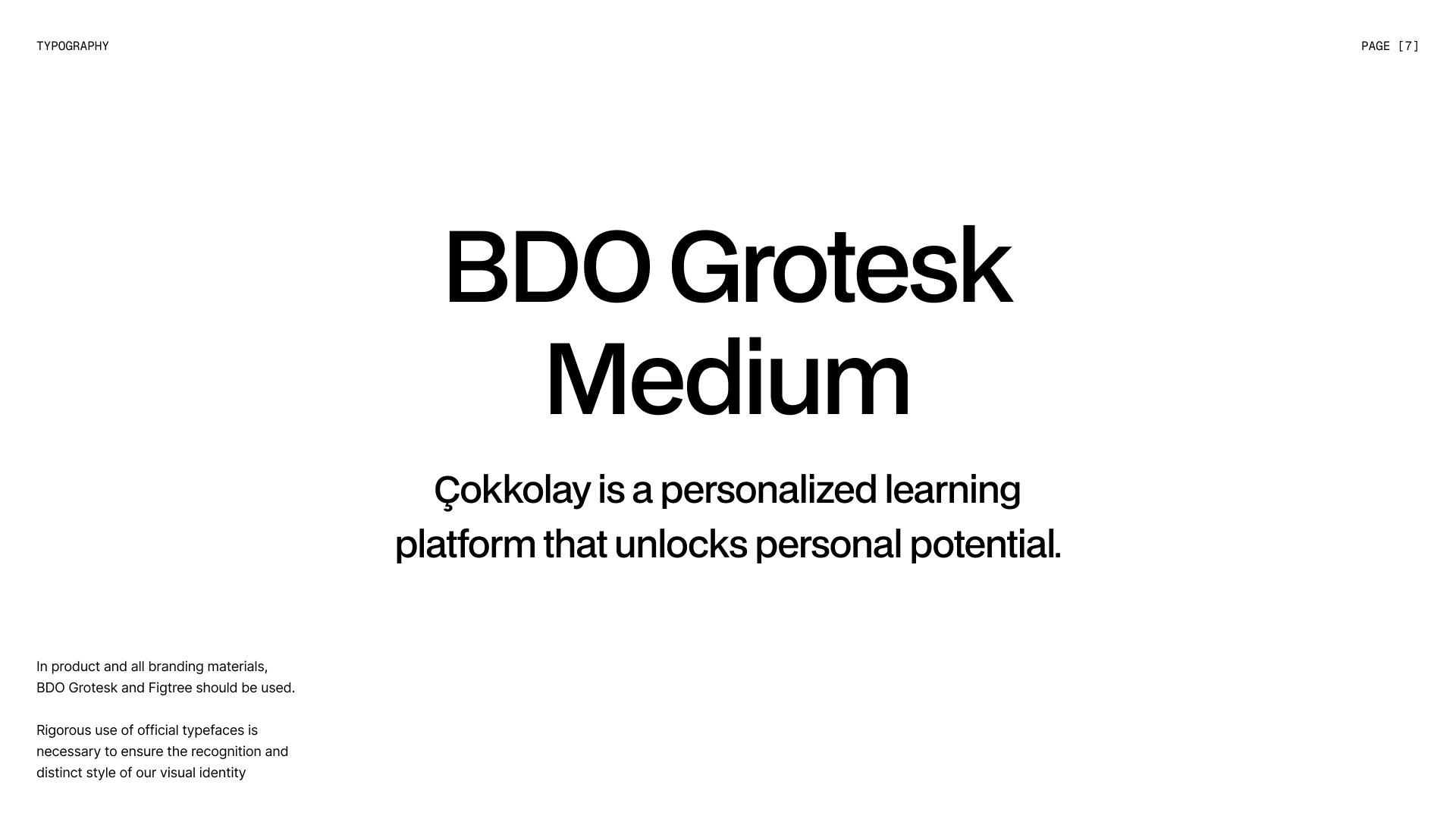
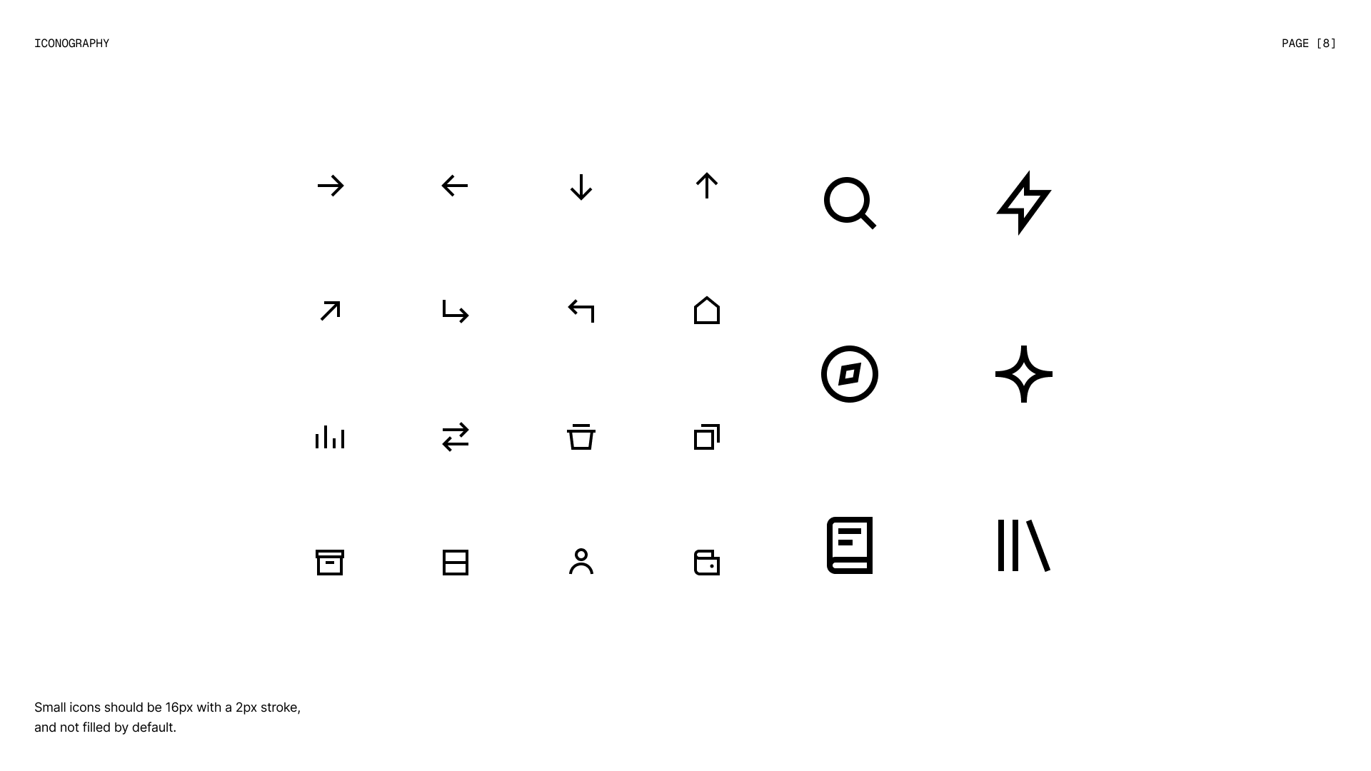
Purple (#A056FF) is the main brand color, balanced with a soft pink (#FFDBFE). Together, and in the blue-to-pink, purple-to-pink and red-to-pink gradients, they symbolize the transformation from chaos to order, from uncertainty to clarity. BDO Grotesk and Figtree give the brand a clear, friendly voice, while a 16px icon set with a 2px stroke keeps the interface consistent.
Stationery
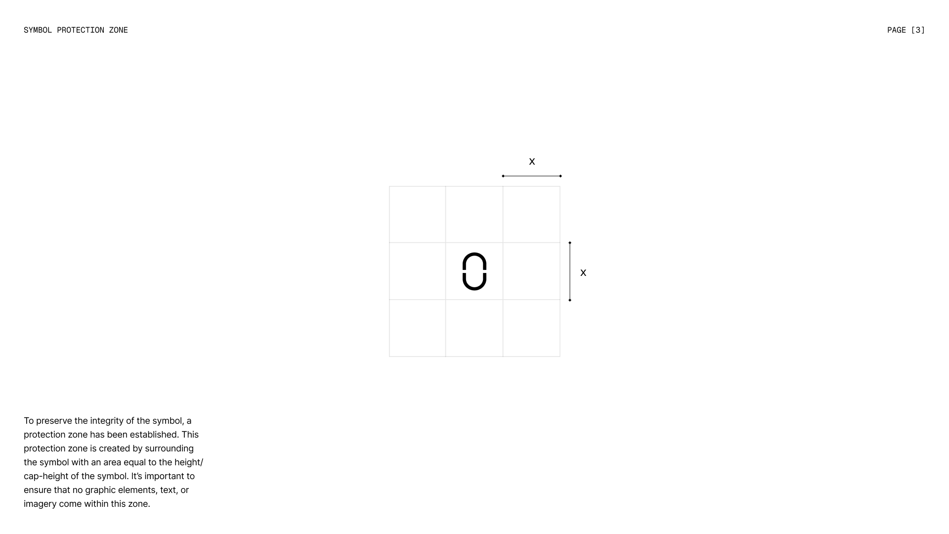
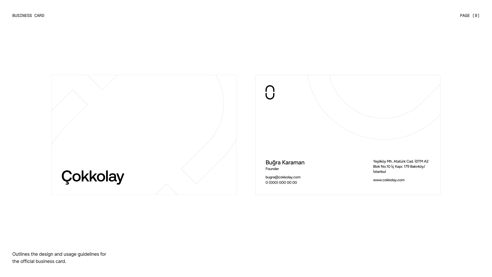
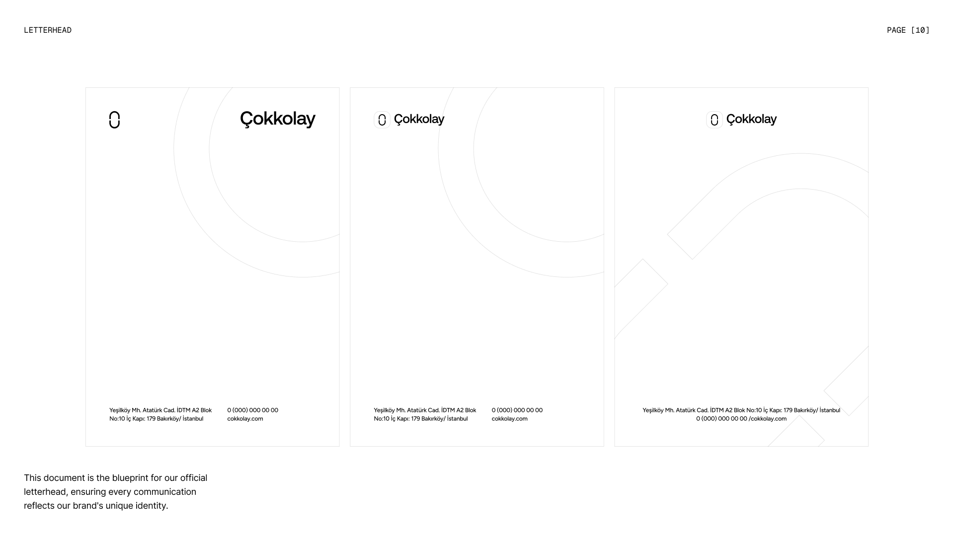
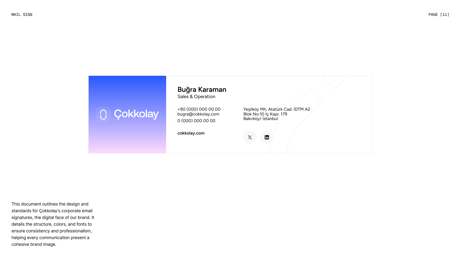
Business cards, letterheads and email signatures carry the same restraint: generous white space, the symbol as a quiet signature and the protection zones defined in the guidelines. Every touchpoint feels like part of one calm, confident system.
Unlock your potential
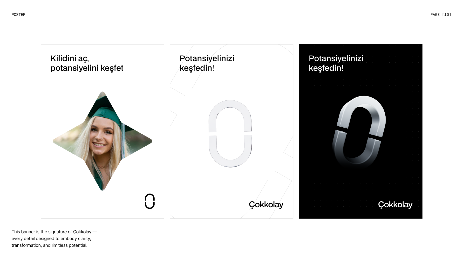
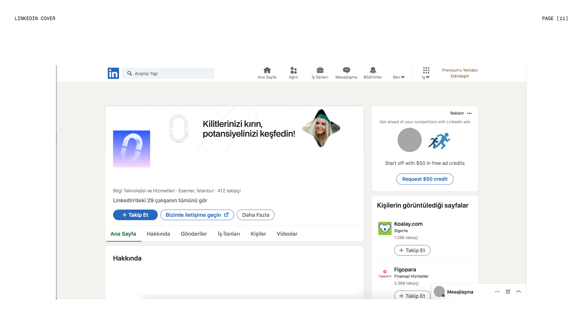
“Kilidini aç, potansiyelini keşfet”: unlock it, discover your potential. Posters and social media bring the symbol to life in 3D and pair it with real students, turning the path metaphor into a message of freedom: break your chains and discover what you are capable of.