A logo that smiles
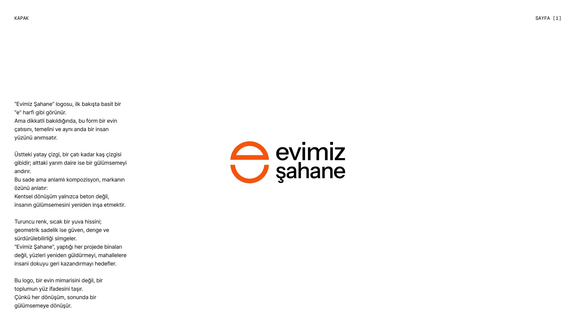
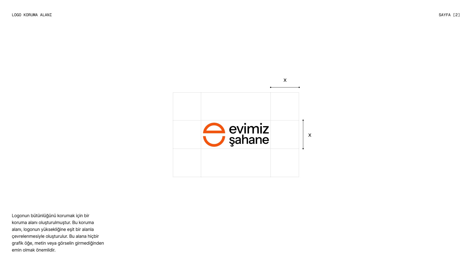
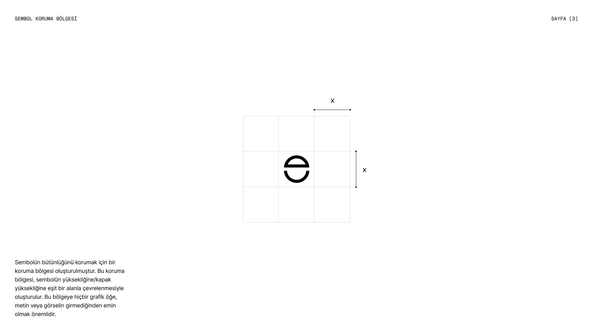
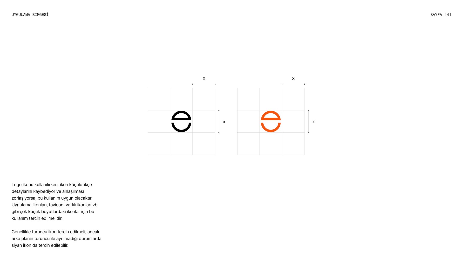
At first glance the Evimiz Şahane mark is a simple letter “e”. Look closer and it becomes the roof and foundation of a house, and a human face at the same time. The horizontal line on top reads as both a roof and an eyebrow, while the half circle below turns into a smile. Every transformation, in the end, becomes a smile.
Warm, geometric, reliable
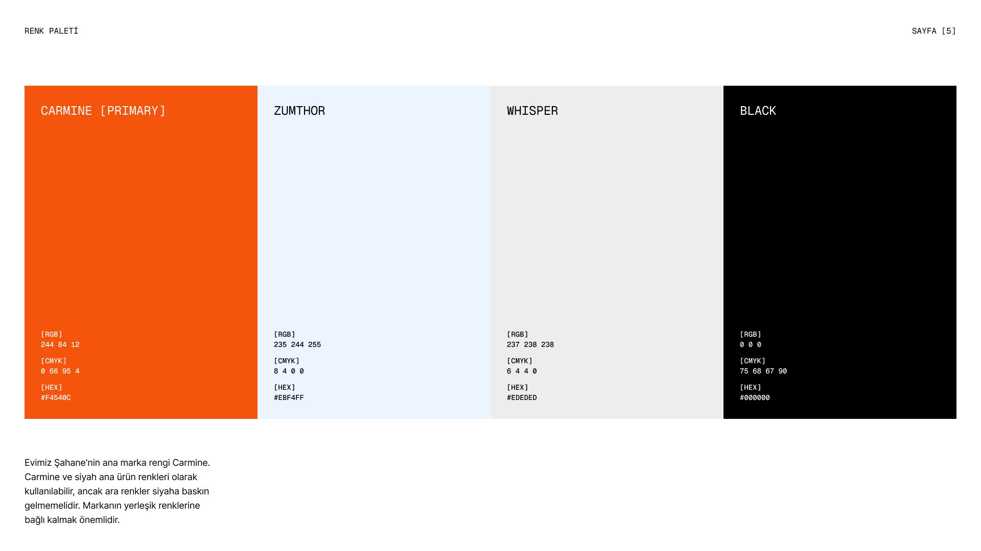
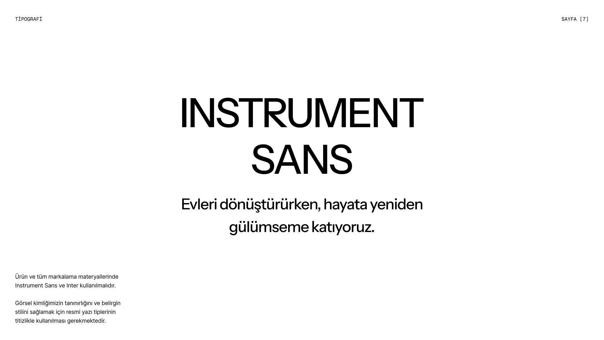
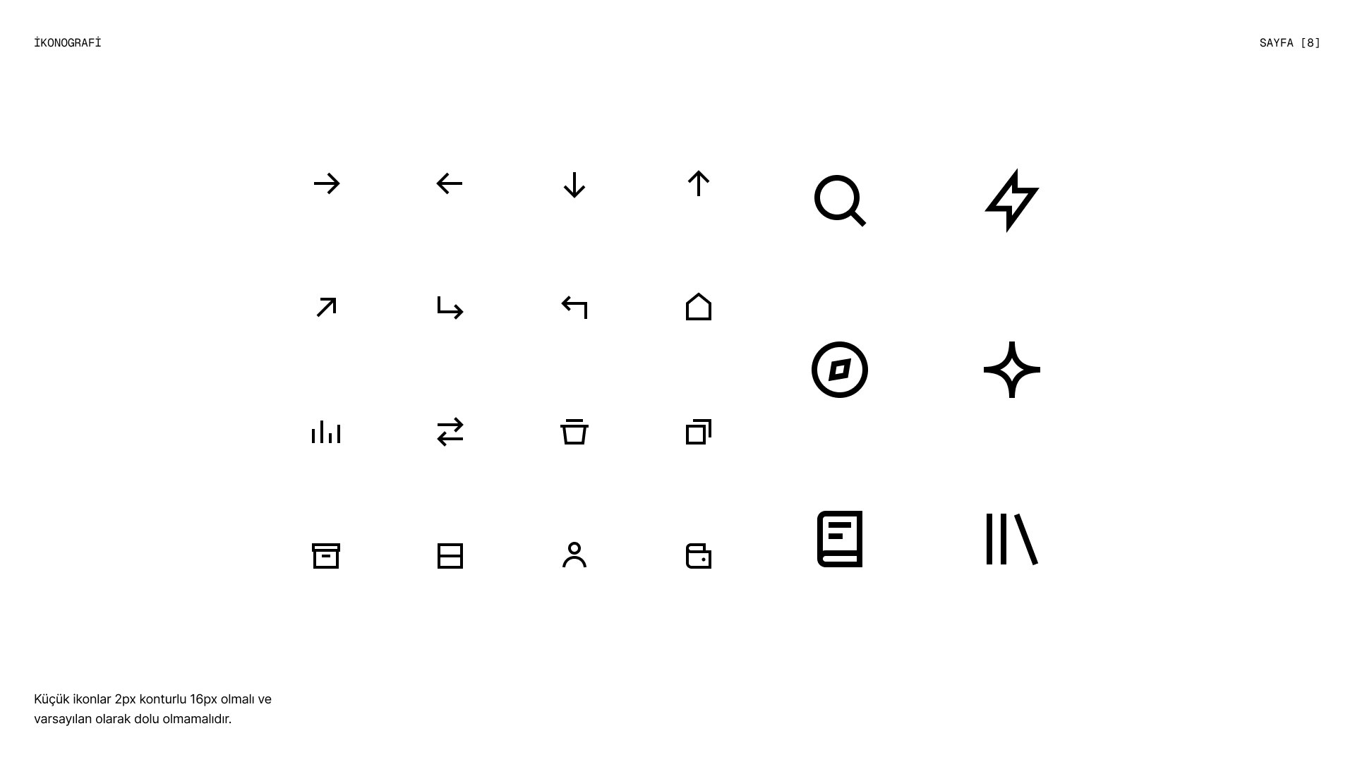
Carmine is the main brand colour: the warmth of a home, balanced with black and soft neutrals so it never overwhelms. Geometric simplicity stands for trust, balance and sustainability. Instrument Sans and Inter give the brand a clear, contemporary voice, and a 16px icon set with a 2px stroke keeps every detail consistent.
Stationery
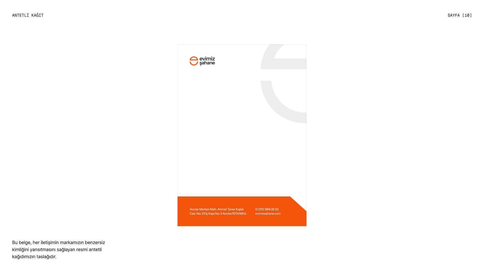
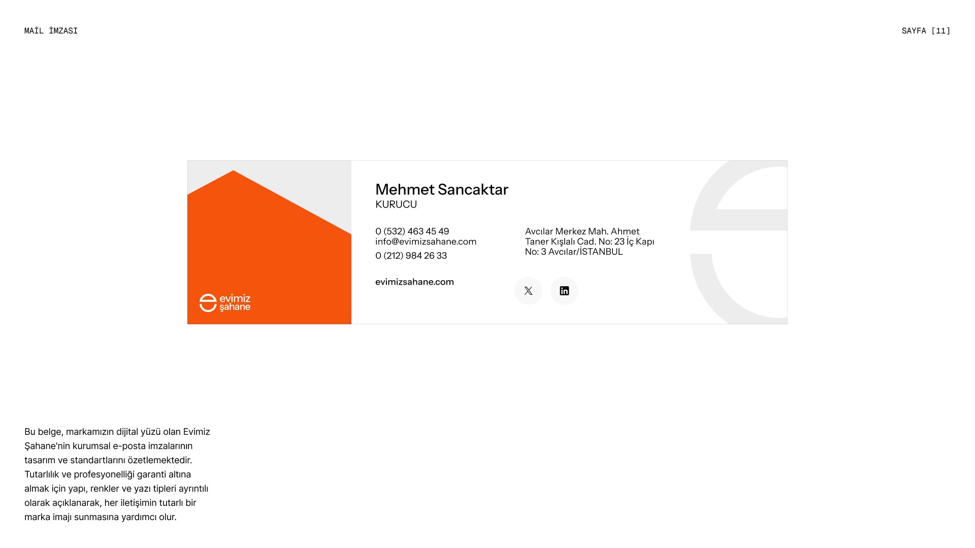
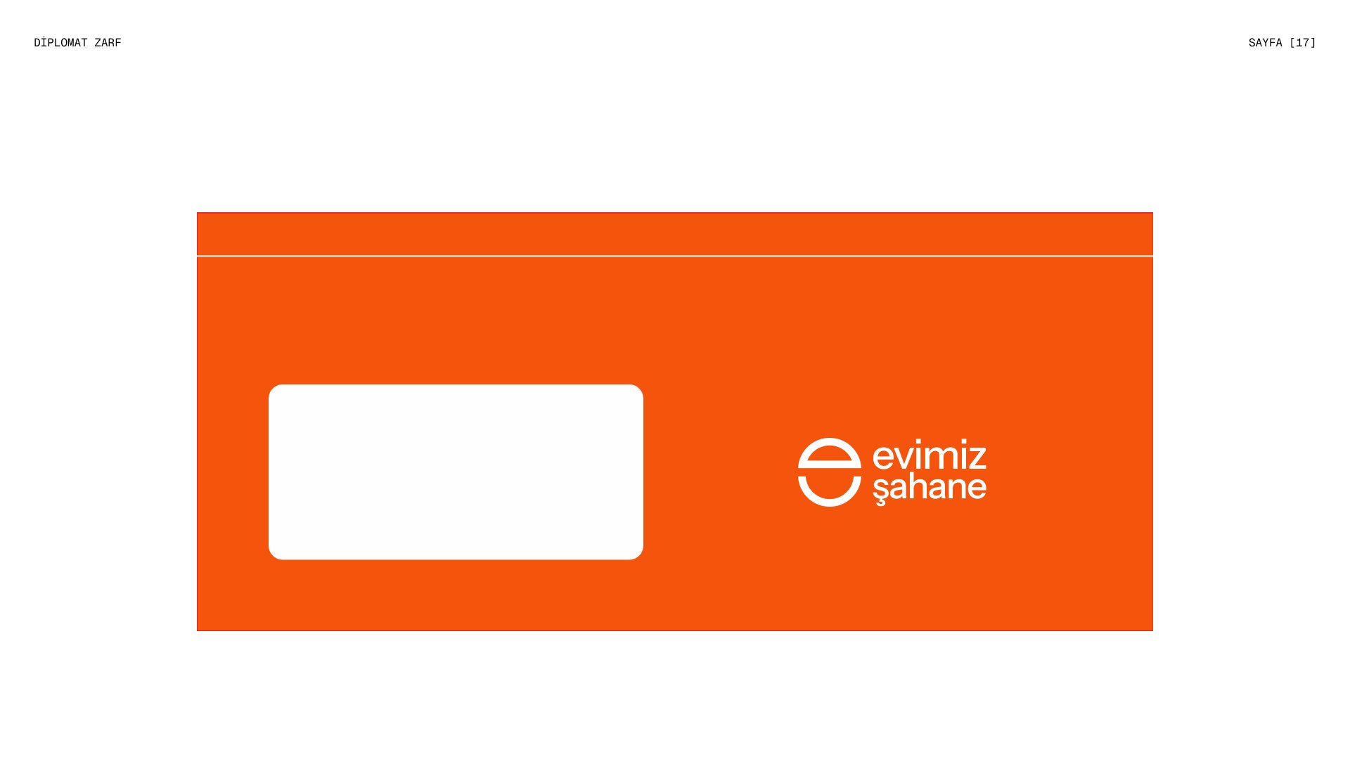
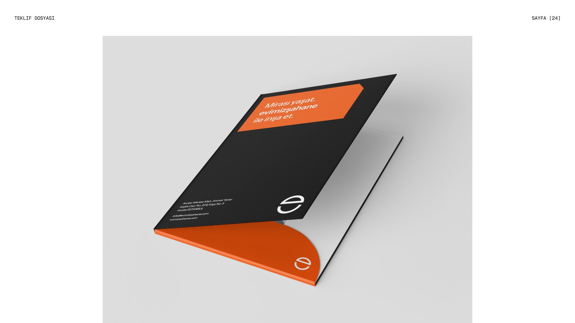
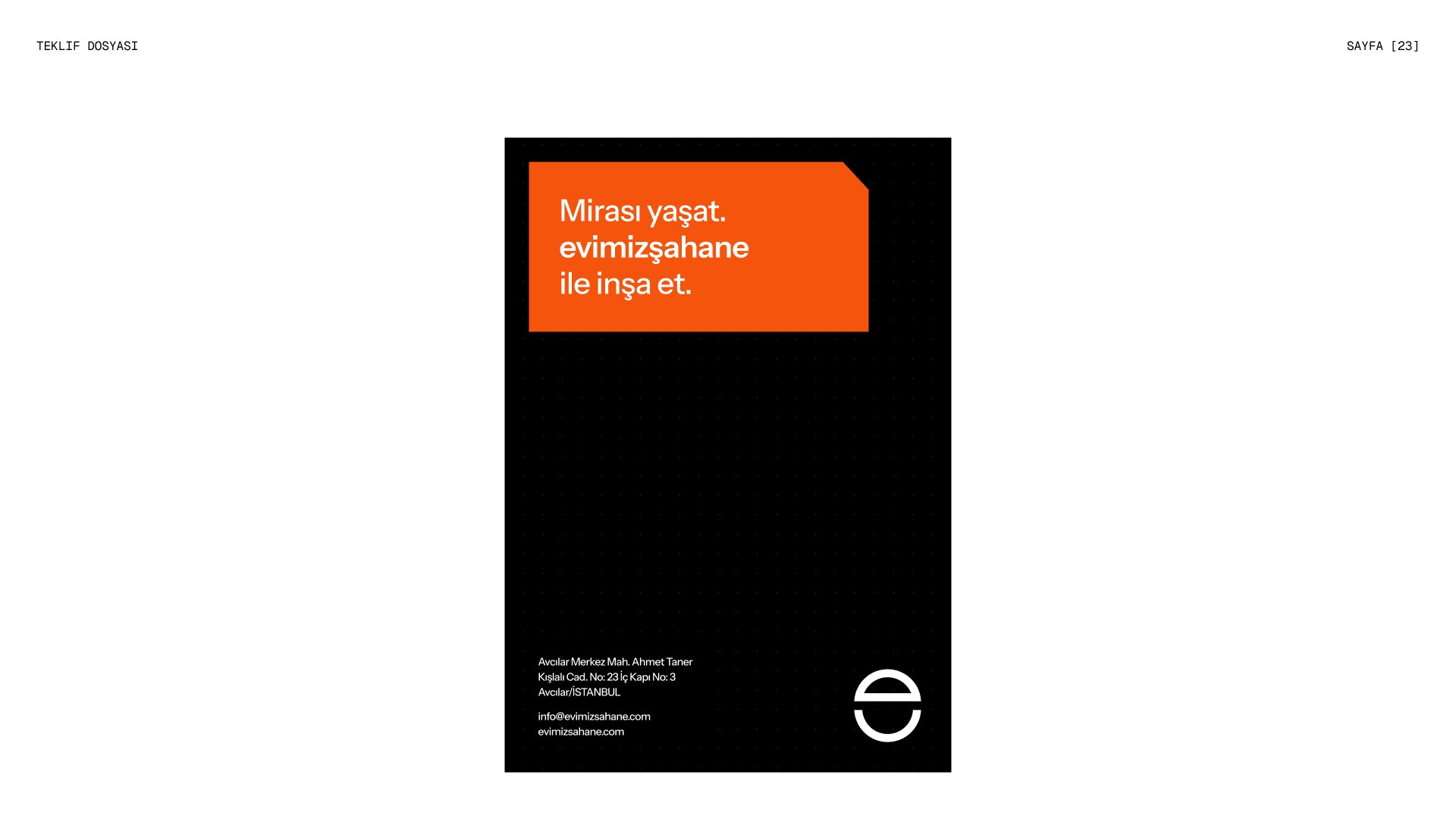
Business cards, letterheads, email signatures, envelopes and proposal folders share the same bold carmine blocks and a house-shaped cut that echoes the symbol. Every document that leaves the office feels like part of one system.
Mirası yaşat. Evimiz Şahane ile inşa et.
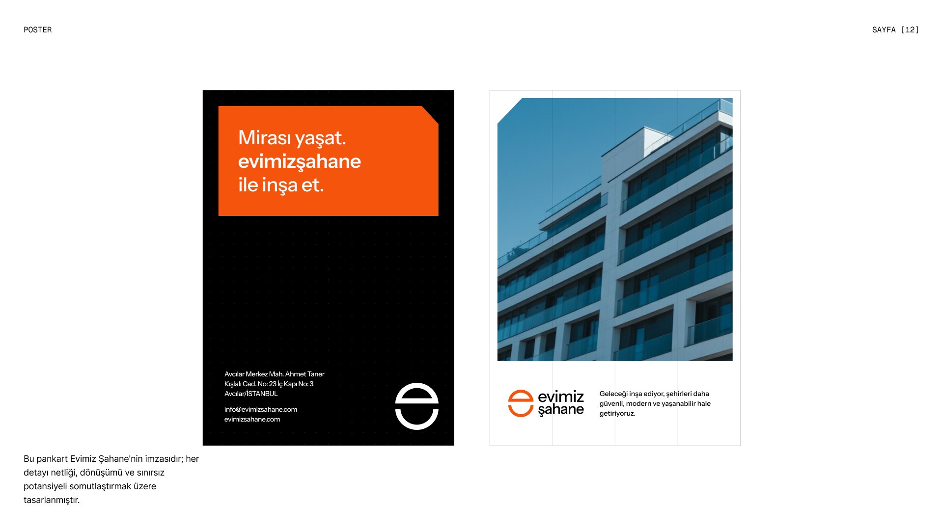
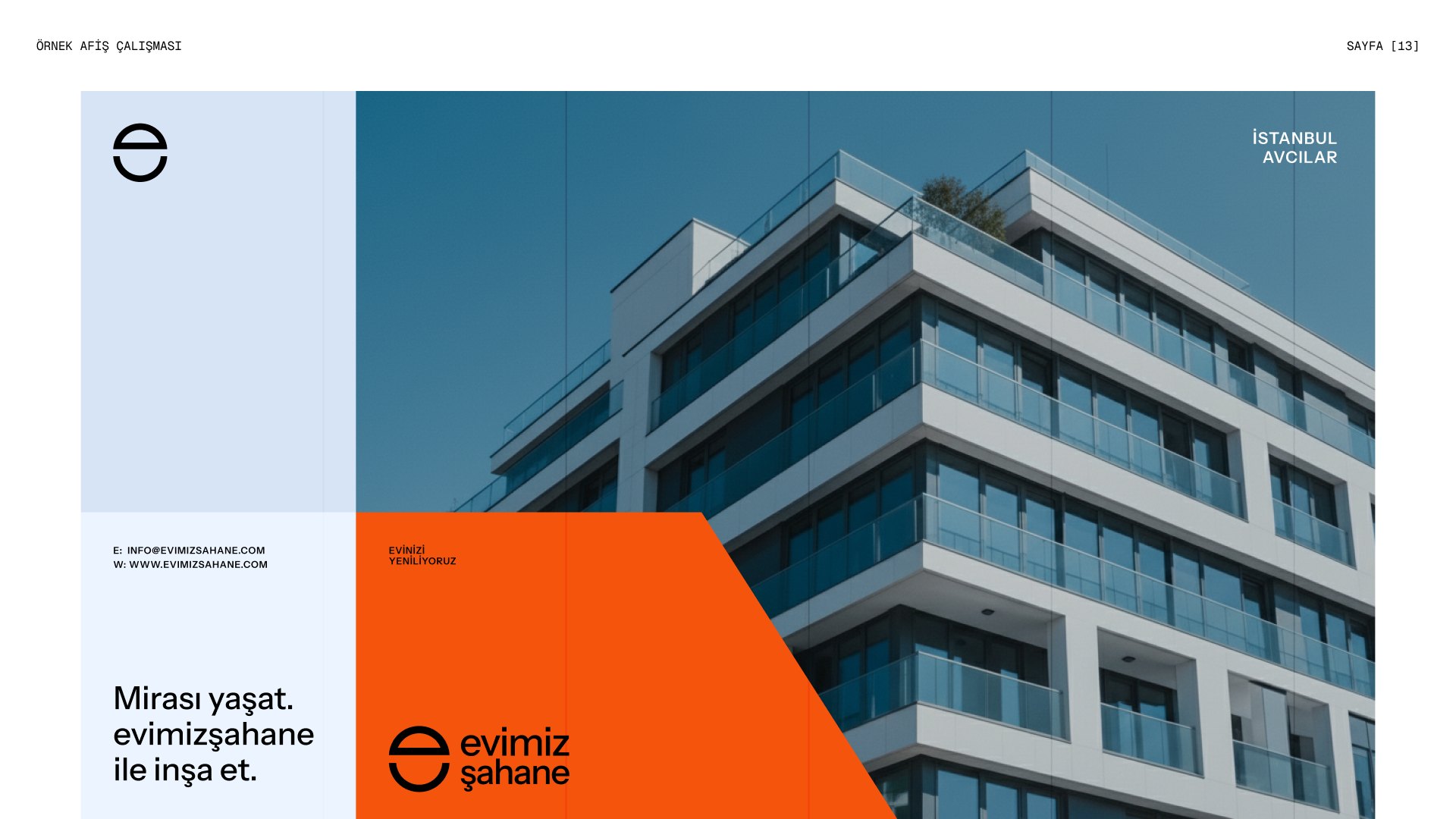
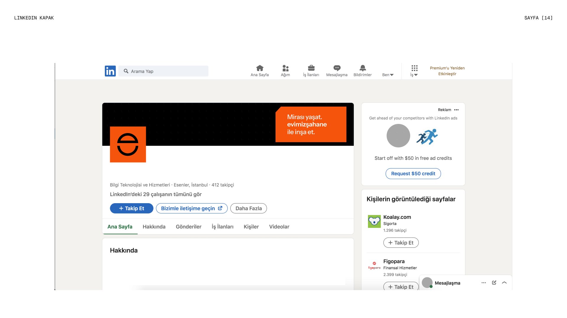
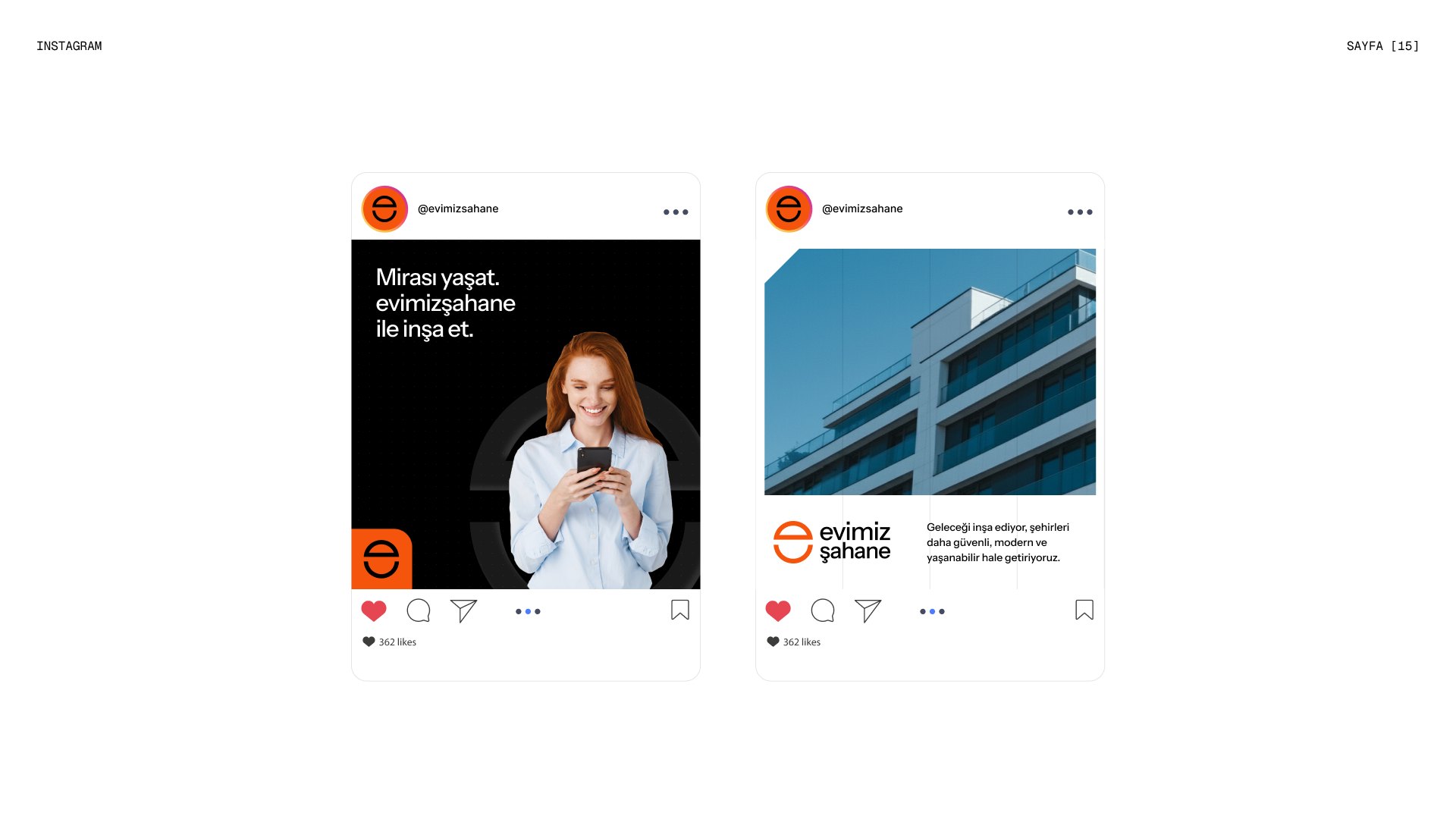
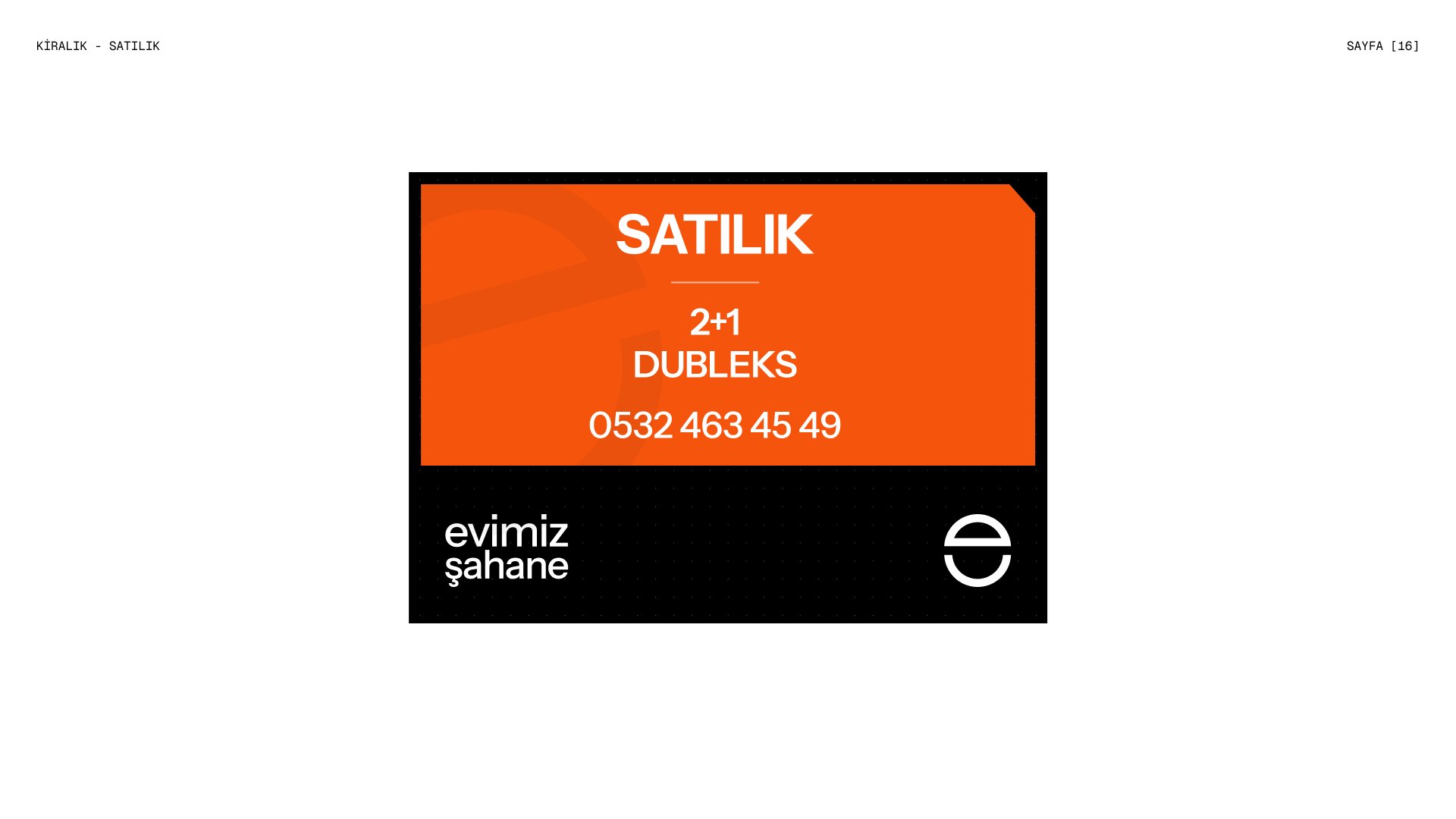
“Keep the legacy alive, build with Evimiz Şahane.” The tagline runs through posters, social media, LinkedIn and for-sale signs, pairing strong typography with bright architectural photography to make urban transformation feel safe, modern and liveable.
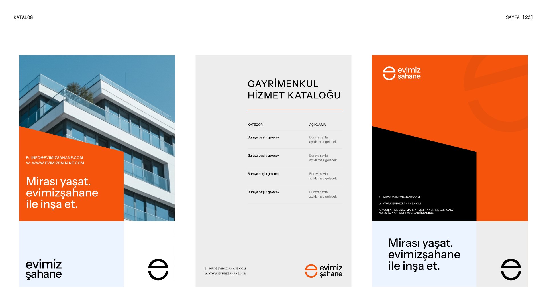
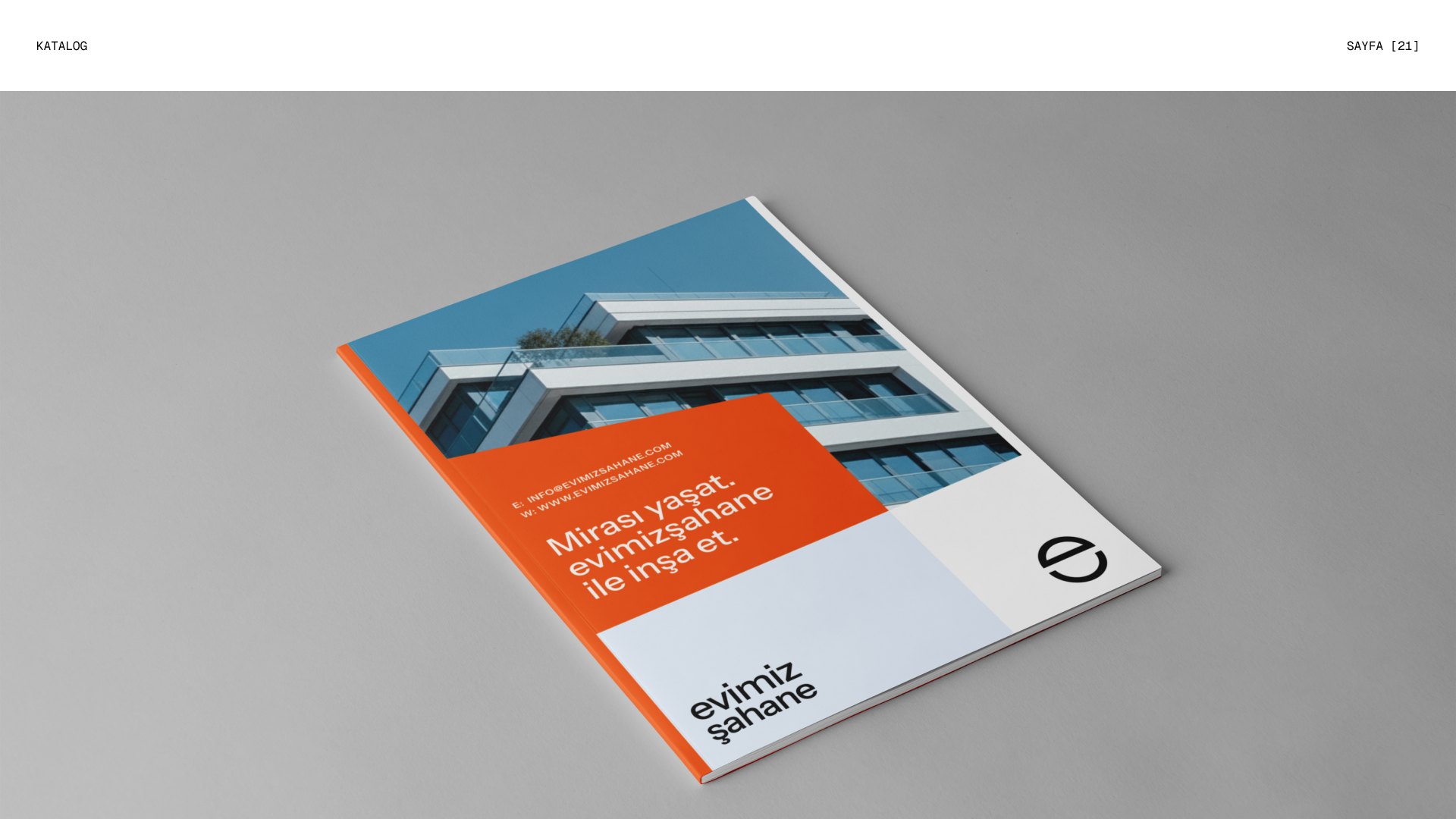
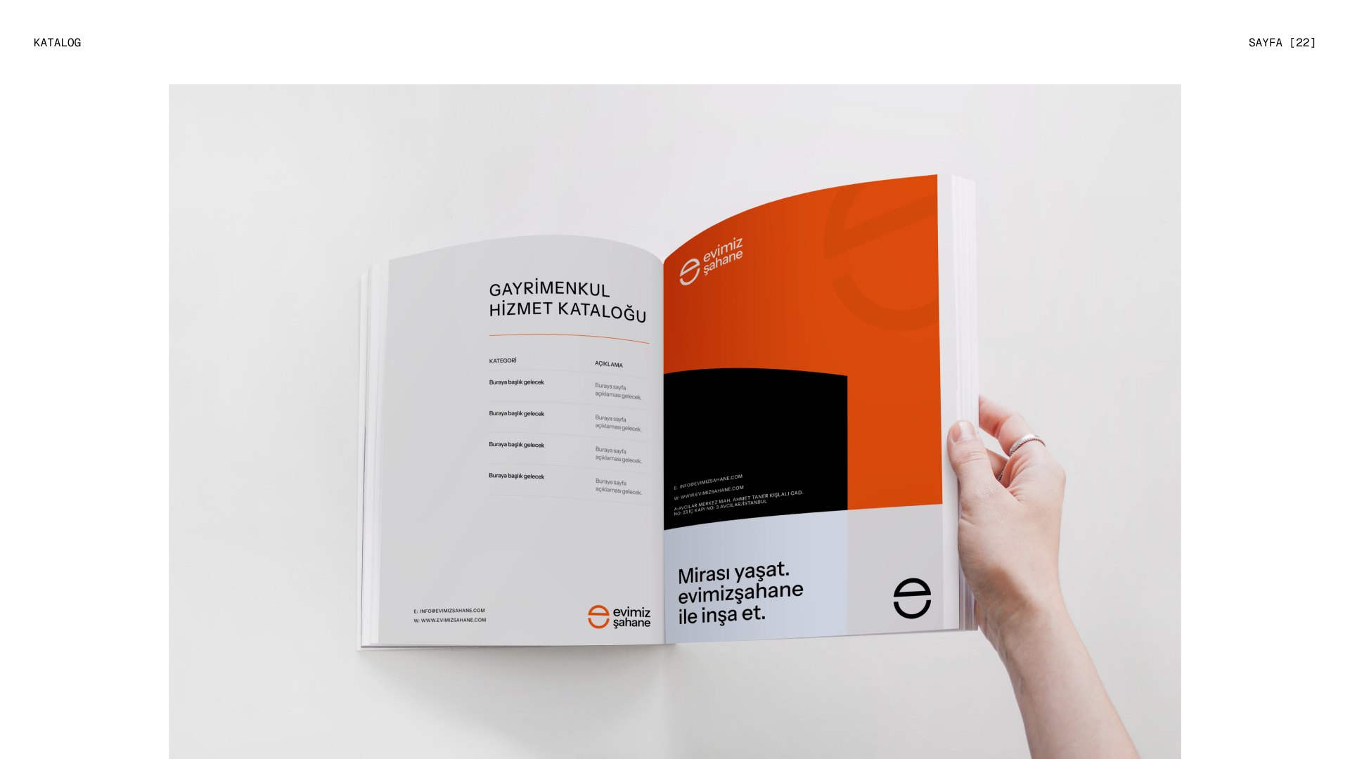
Catalogue & publications
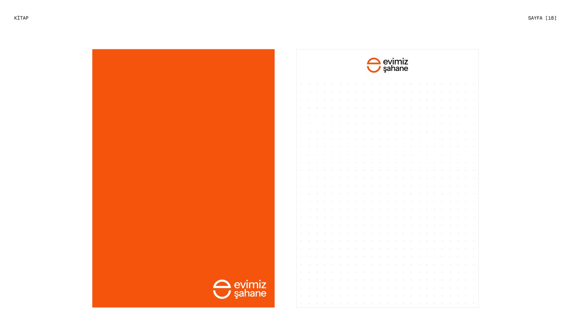
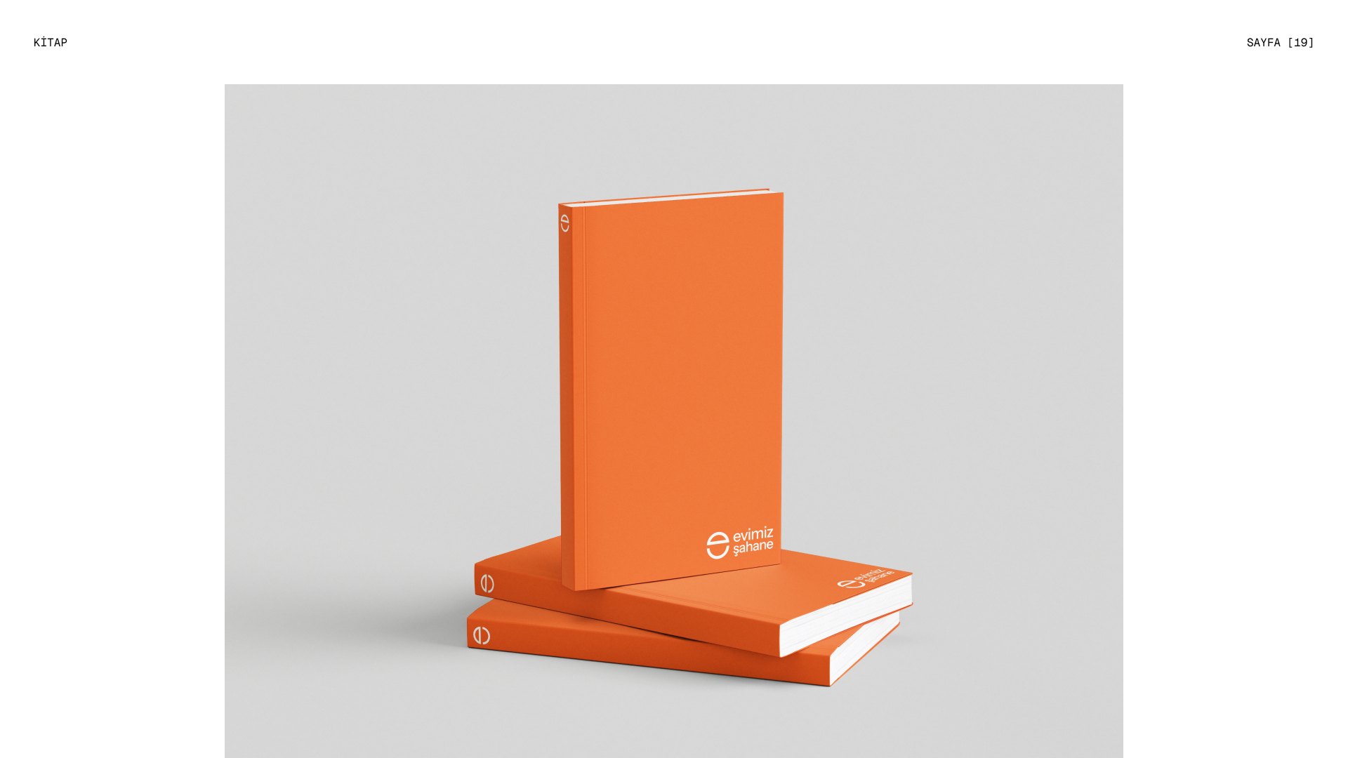
A real estate service catalogue, notebooks and proposal files carry the identity into long-form communication: calm grids, generous white space and carmine covers that stand out on any desk.
On the street
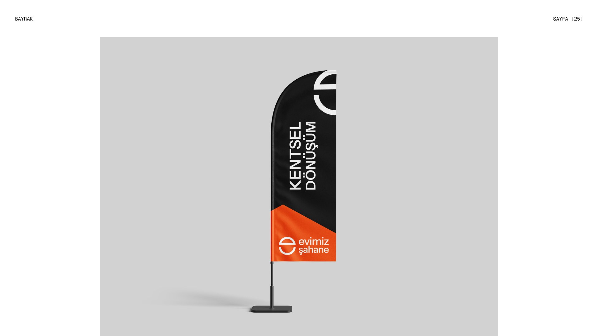
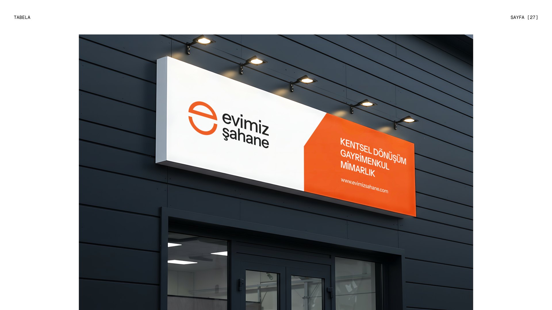
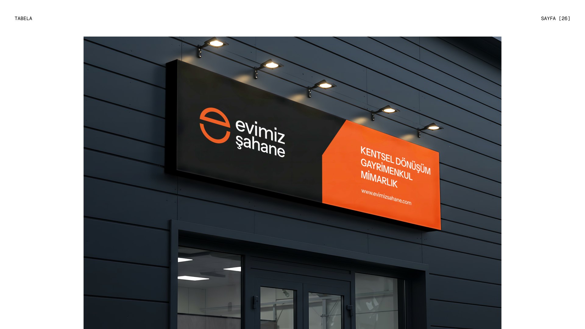
Flags and illuminated signage bring the smile to construction sites and offices, where the brand meets neighbourhoods face to face.