Challenge
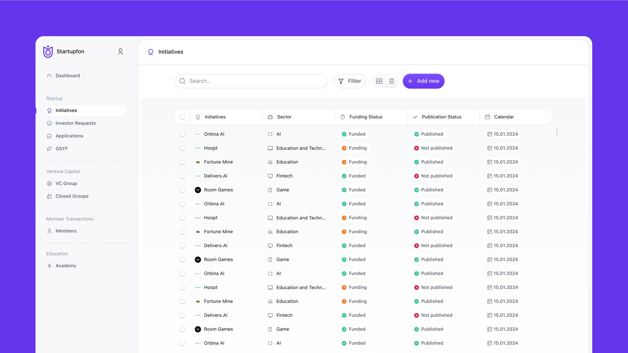
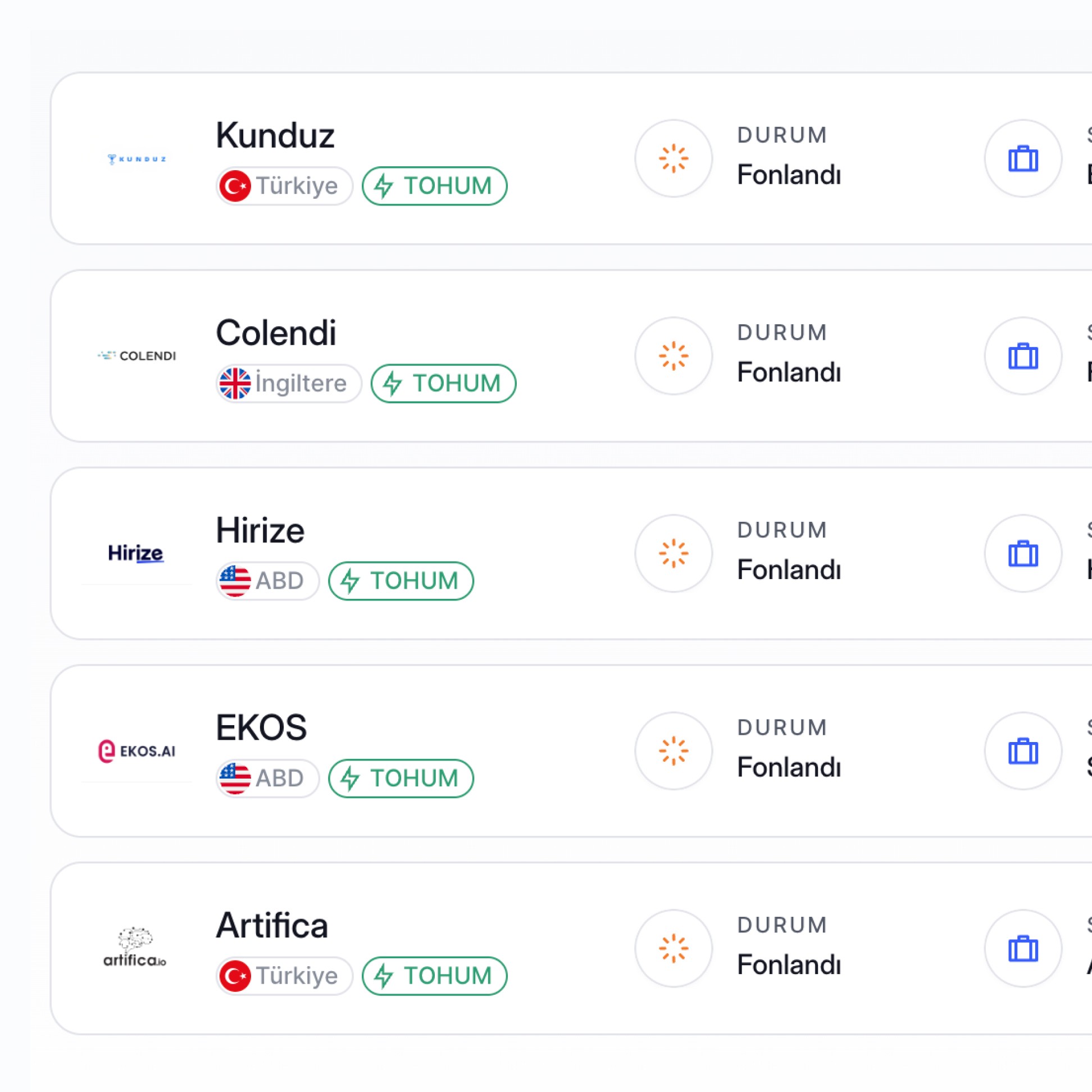
The biggest challenge in investment technology was making a traditionally complex and intimidating process accessible to everyone. Startupfon had to bridge the gap between seasoned investors who expect depth and transparency, and younger audiences who demand simplicity and clarity. The design challenge lay in translating financial jargon, multi-step workflows, and risk-heavy decisions into a seamless and confidence-inspiring experience. The goal was not just to create an investment platform, but to build an environment that communicates trust, simplifies decision-making, and highlights the ease of joining the startup ecosystem.


Experience focus
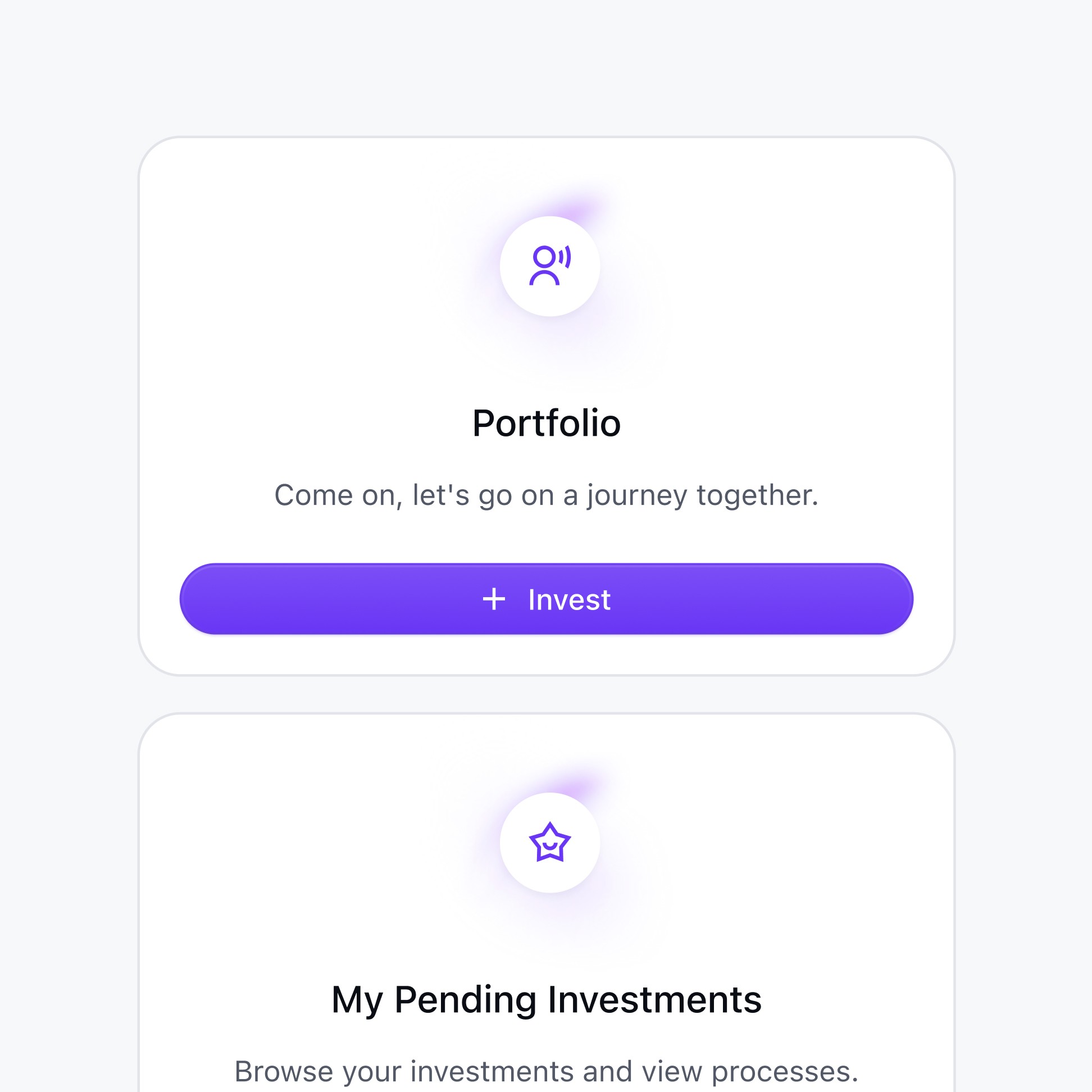
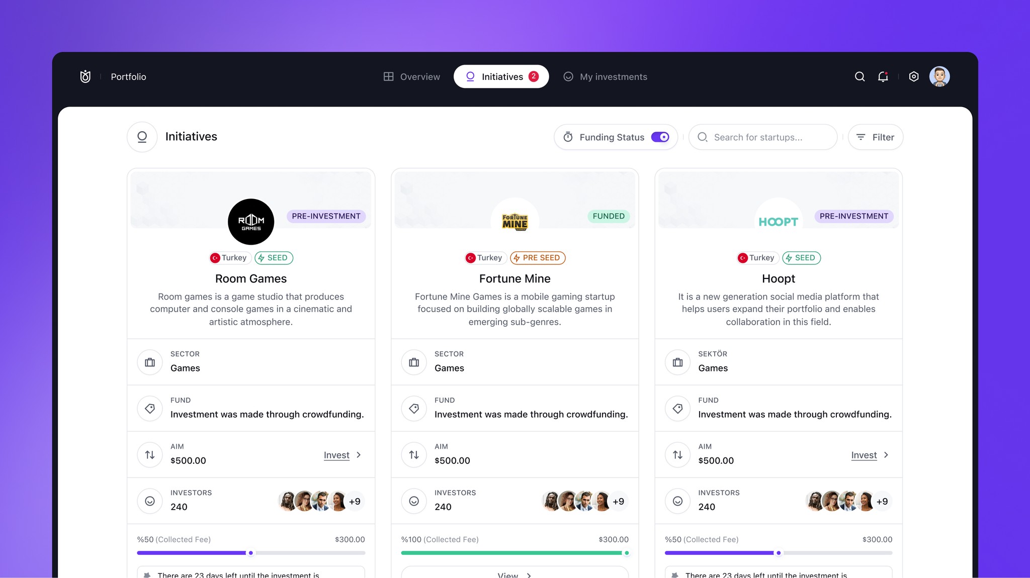
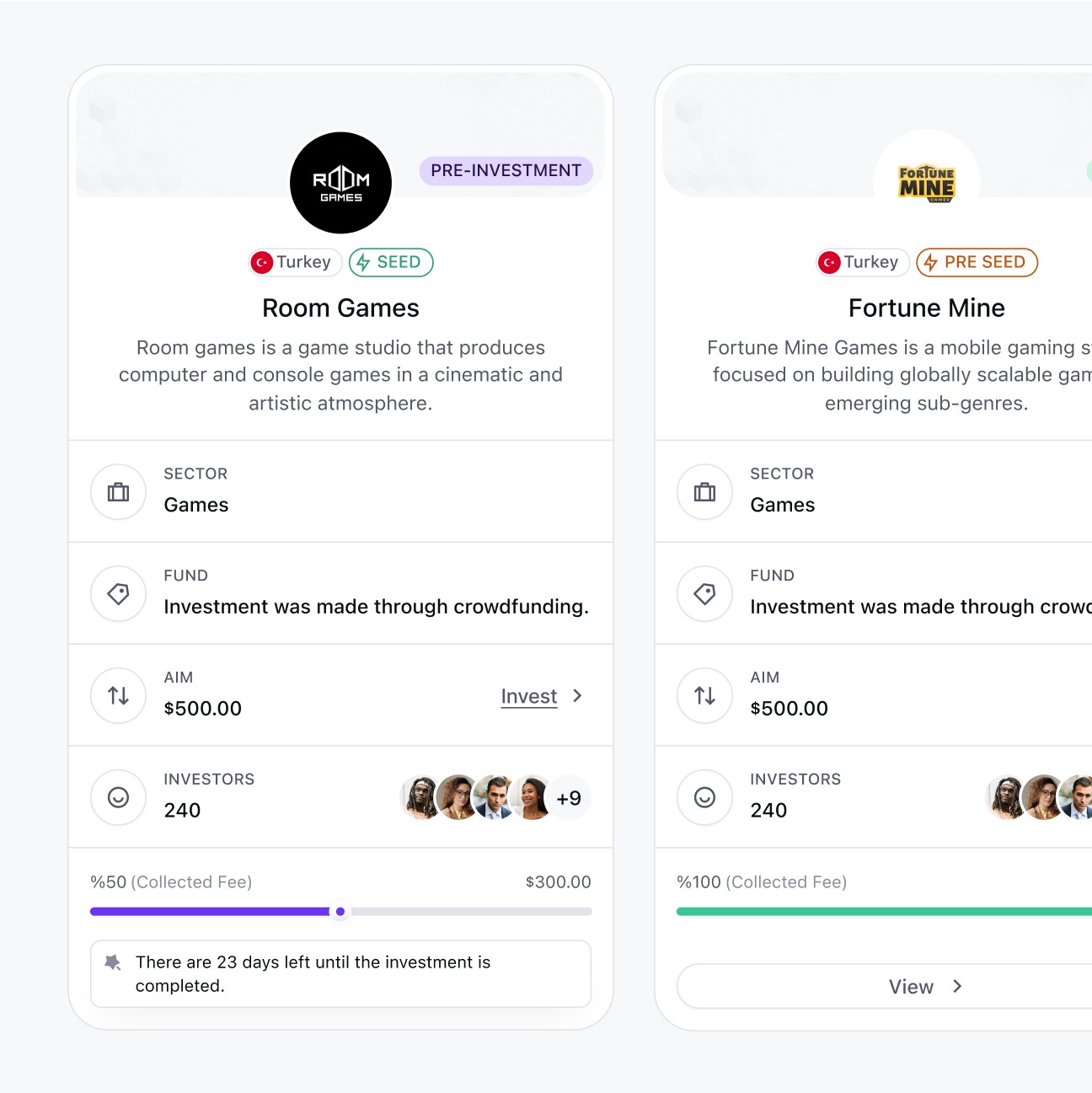
In the user experience, we have worked on simplifying the complexity of investment processes across different dashboards. By focusing on clarity, transparency, and accessibility, we aimed to ensure that both investors and startups can navigate the system independently. In short, our priority was to transform a sophisticated financial structure into an intuitive and comprehensible product experience.
Website re-design
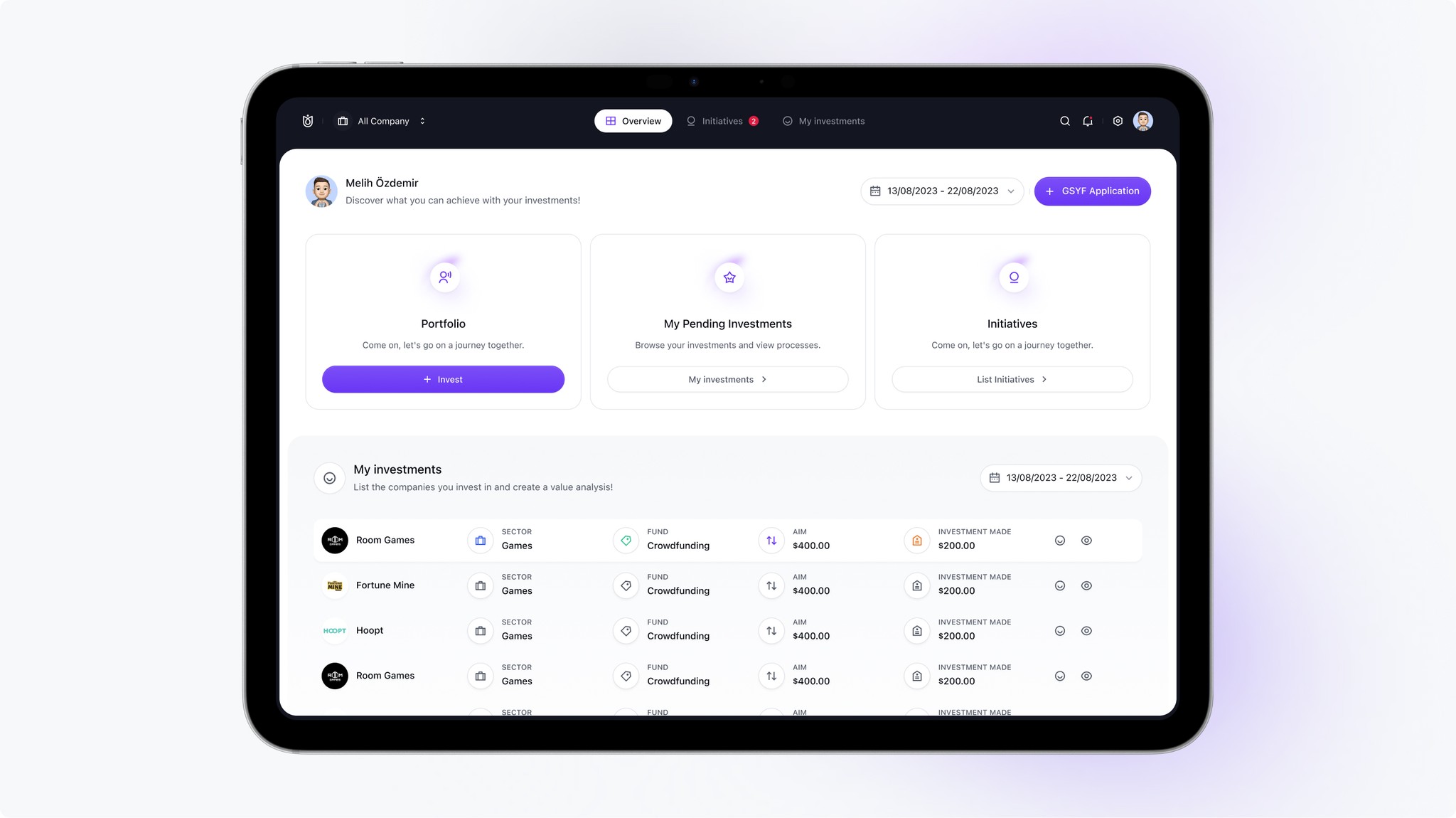
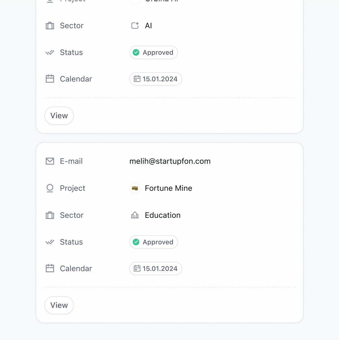
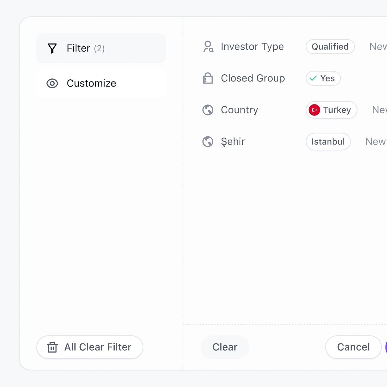
I redesigned Startupfon’s website to create a clear, trustworthy, and conversion-focused experience that simplifies the complex world of startup investments. I focused on making the platform equally approachable for first-time investors and experienced professionals by highlighting transparency, ease of use, and credibility at every step. I restructured key investment flows to guide users effortlessly from exploration to action, while dashboards and venture listings were presented with clarity to reduce friction and uncertainty. My design balanced simplicity with depth, ensuring that users can independently navigate the platform, understand opportunities, and invest with confidence.